More Prompts:
Best prompts for Image Generation ChatGPT for UX mockups using AI for accessibility enhancements
12 copy-ready prompts to generate accessible UX mockups and annotated assets. Each prompt is practical, specific, includes an example, and lists AIs that work best for the task. Use these prompts directly in an image-generation-capable ChatGPT or multimodal AI to produce mockups with accessibility-first details (contrast, keyboard focus, ARIA notes, alt text, dyslexia-friendly fonts, reduced motion, etc.).


Stop Losing Your AI Work
Tired of rewriting the same prompts, juggling ChatGPT and Claude in multiple tabs, and watching your best AI conversations disappear forever?
AI Flow Chat lets you save winning prompts to a reusable library, test all models in one workspace, and convert great chats into automated workflows that scale.

“AI Flow Chat powers our entire content strategy. We double down on what’s working, extract viral elements, and create stuff fast.”
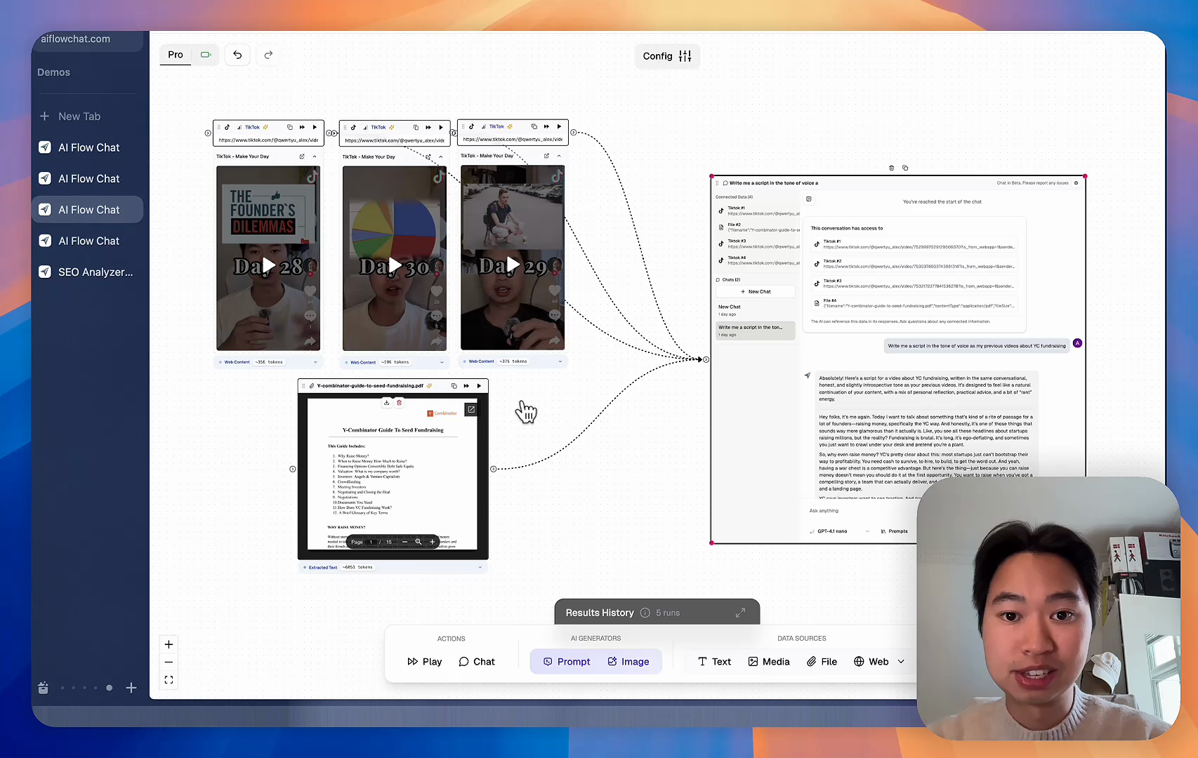
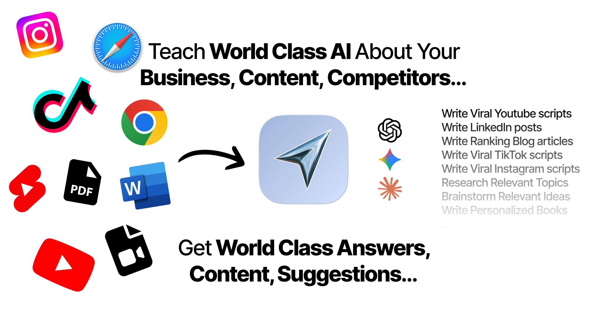
Reference Anything
Bring anything into context of AI and build content in seconds
YouTube
DOCX
Notion
TikTok
Web
Reels
Video Files
Twitter Videos
Facebook/Meta Ads
Tweets
Audio Files
Choose a plan to match your needs
Upgrade or cancel subscriptions anytime. All prices are in USD.
Ideal for testing things out.
then $29/month · new customers only
- See what Basic gets you
- 8,000 credits per month
- Access to all AI models
- 5 app schedules
- Free optional onboarding call
- 1,000 extra credits for $6
7-day free trial. Cancel anytime.
For normal daily use.
- See what Scale gets you
- 18,000 credits per month11% more credits per $ than Basic
- Access to all AI models
- 10 app schedules
- Free optional onboarding call
- 1,000 extra credits for $6
No risk, cancel anytime.
For power users with high-volume needs.
- See what Pro gets you
- 40,000 credits per month10% more credits per $ than Scale
- Access to all AI models
- 15 app schedules
- Remove AI Flow Chat branding from embedded apps
- Free optional onboarding call
- Purchase extra credits at 50% price
- 2,000 extra credits for $6
No risk, cancel anytime.
Frequently Asked Questions
Everything you need to know about AI Flow Chat. Still have questions? Contact us.