More Prompts:

Best prompts for Image Generation ChatGPT for UX mockups using AI for wireframing

12 copy-ready, practical prompts to generate clear UX wireframes and mockups with image-capable ChatGPT/AI image models. Each prompt is specific about device, layout, spacing, states, exports and accessibility so you can paste it directly and get usable wireframe images or screen sets.
GPT-5
Claude Opus 4
Claude Sonnet 4
Gemini 2.5 Flash
Gemini 2.5 Pro
You know that moment when you ask ChatGPT to create a wireframe and get back something that looks like it was drawn by a caffeinated toddler? You're not alone in the struggle of getting AI to produce actual, usable UX designs instead of abstract art that makes you question your career choices. The frustration is real when you need clean mockups fast, but every AI-generated attempt looks like a Pinterest fever dream.
These 12 battle-tested prompts transform your AI wireframing game from chaotic mess to professional clarity. You'll get copy-ready prompts that specify everything from device dimensions to accessibility requirements, covering mobile onboarding flows, responsive dashboards, e-commerce pages, and complete component libraries. Instead of wrestling with vague AI outputs, you'll generate pixel-perfect wireframes and mockups that actually look like something you'd present to stakeholders without embarrassment.
1
Mobile Onboarding Flow (Low-Fidelity)
Create a low-fidelity mobile onboarding wireframe for a 360x800 phone. 3 screens: welcome, permissions, final CTA. Use a 4-column layout with 16px gutter, 24px vertical rhythm. Placeholder image (60% width) at top, headline (H1) 28px bold, body text placeholder 14px, primary CTA bottom full-width 48px tall, secondary 'Skip' text link top-right. Use grayscale panels, outline icons, and annotate each element with labels (e.g., "Hero image, Headline, CTA"). Export three PNGs named onboarding_1.png, onboarding_2.png, onboarding_3.png.
Generate a clear low-fidelity onboarding flow for a mobile app with explicit layout, spacing and export specs.
2
Responsive Dashboard Wireframe (Desktop + Tablet)
Produce two wireframe images: Desktop (1440x900) and Tablet (1024x768). Use a 12-column grid on desktop and 8-column grid on tablet. Desktop: left vertical nav 240px, top global header 64px, 3-column card layout with 24px card gutters, data table full-width below. Tablet: collapsed nav (hamburger), 2-column card layout. Use neutral gray backgrounds, card shadows subtle, include sample KPI cards (title, numeric, small chart placeholder), and annotate responsive breakpoints and grid column spans. Export: dashboard_desktop.png and dashboard_tablet.png.
Produce paired desktop and tablet wireframes showing a dashboard layout with grid, side nav, and card components.
3
E-commerce Product Page (High-Fidelity Mockup)
Generate a high-fidelity product page mockup for desktop (1280x900). Layout: left image column (600x600 hero), below a 4-thumb carousel; right details column with product title H1 34px, price $199 bold 28px, variant selectors (color swatches 40px), quantity stepper, sticky Add to Cart button fixed at bottom of viewport (desktop sticky bar 72px high). Include wishlist icon, rating stars, and collapsed accordion for reviews/specs. Use brand color #0A84FF for primary, ensure button contrast ratio passes WCAG AA. Label all components and export as product_desktop.png.
High-fidelity product page mockup with image carousel, price/variant area, sticky add-to-cart, and accessibility notes.
4
Landing Page Wireframe with F-Pattern
Produce two wireframes: Desktop (1366x768) and Mobile (375x812) landing pages following F-pattern layout. Desktop: hero left-aligned headline H1 42px, subheadline 18px, primary CTA top-left, secondary CTA outline, right-side hero illustration placeholder. Below hero: three feature columns with icon and short copy, trust badges row, and footer. Mobile: stacked single column with hero image on top. Use 24px baseline, 3-column feature grid collapses to single column on mobile. Label content blocks and CTAs. Export as landing_desktop.png and landing_mobile.png.
Create a desktop and mobile landing page wireframe emphasizing F-shape reading flow and clear CTAs.
5
Onboarding Carousel Screens (Exportable Frames)
Generate 5 consistent carousel frames for mobile (390x844). Each frame must include a central illustration placeholder, concise headline, subtext, progress dots at bottom, 'Next' primary CTA and 'Skip' link in top-right. Provide states for initial, mid, and final screens (final screen shows 'Get Started' CTA). Style: soft rounded cards, use neutral gray wireframe with one accent color #FF6B6B. Export frames named onboarding_frame01.png through onboarding_frame05.png and include annotations: 'Progress dot size 8px', 'Primary CTA 44px x full-width minus 24px margins'.
Design a 5-step onboarding carousel with progress indicators and export each frame separately.
6
Admin CRUD Form States
Create a single artboard (1280x720) split into four panels showing a CRUD form for 'Create Product' in four states: Empty (placeholders), Filled (valid inputs), Error (field-level red messages and icons), Success (inline green check and 'Saved' toast). Fields: Title, SKU, Price, Category dropdown, Image upload placeholder, Save and Cancel buttons. Show inline validation copy, error color #E53935, success color #2E7D32, and keyboard shortcut hint 'Cmd+S' near Save. Label each panel with the state name.
Produce wireframes that show empty, filled, error and success states for a CRUD form with inline validation.
7
Microinteraction States Storyboard
Create a 1200x800 storyboard containing 6 frames showing microinteraction states for a primary button and modal: default button, hover (elevation + color shift), pressed (scale -2%), disabled (30% opacity), loading (spinner overlay), and modal open/close sequence (overlay fade + slide-in). Annotate durations (hover transition 150ms, press 100ms, modal open 250ms) and CSS properties (box-shadow, transform). Use clear grayscale with primary color #0A84FF for interactions.
Storyboard common microinteractions (hover, pressed, disabled, loading, modal open/close) for a component set.
AI Flow Chat

Stop Losing Your AI Work

Tired of rewriting the same prompts, juggling ChatGPT and Claude in multiple tabs, and watching your best AI conversations disappear forever?

AI Flow Chat lets you save winning prompts to a reusable library, test all models in one workspace, and convert great chats into automated workflows that scale.
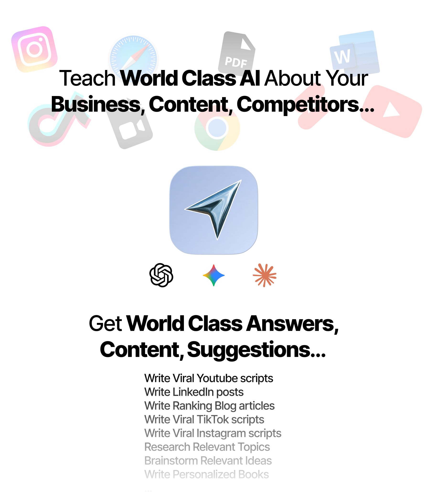
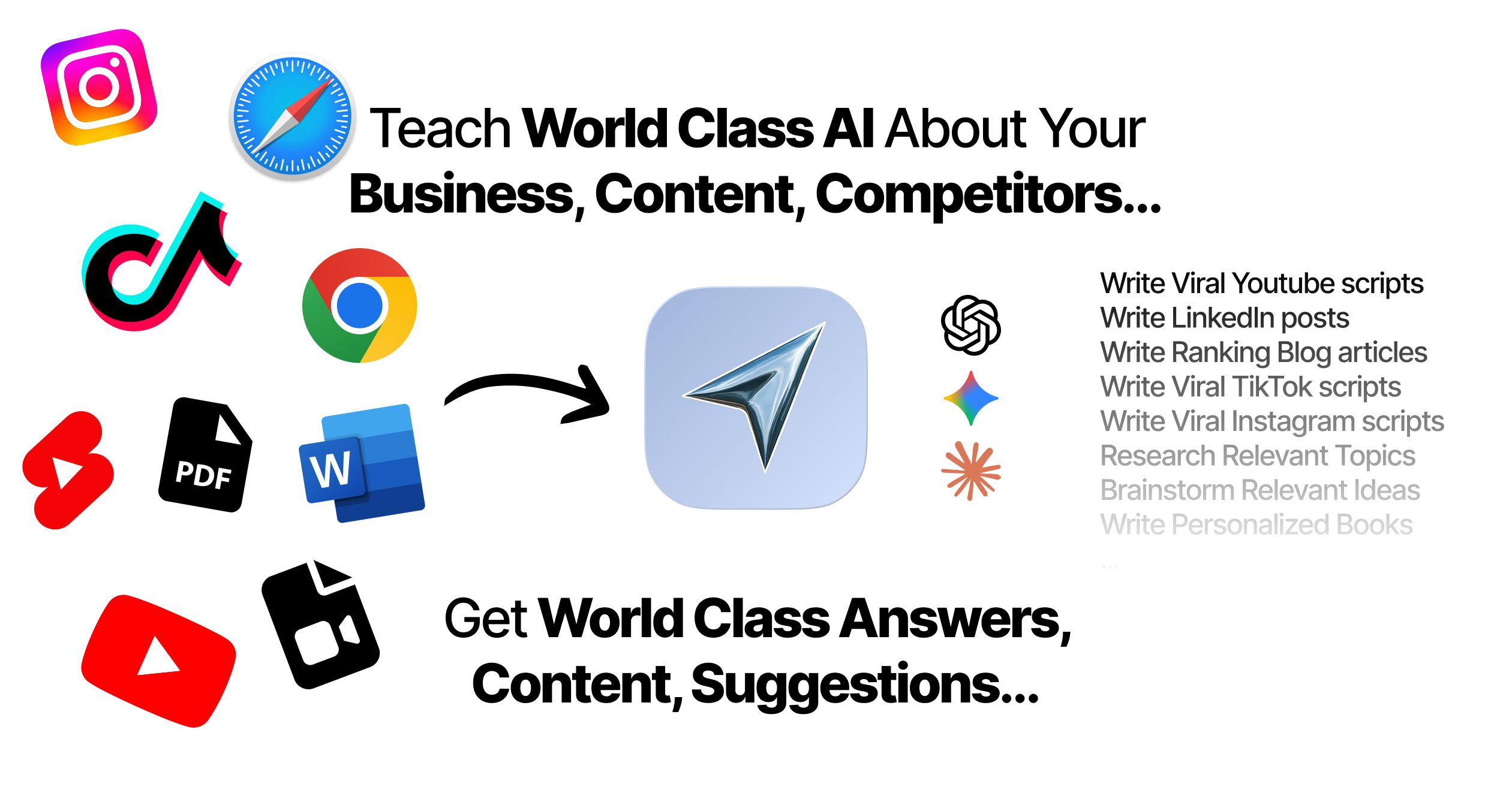
Teach World Class AI About Your Business, Content, Competitors… Get World Class Answers, Content, Suggestions...
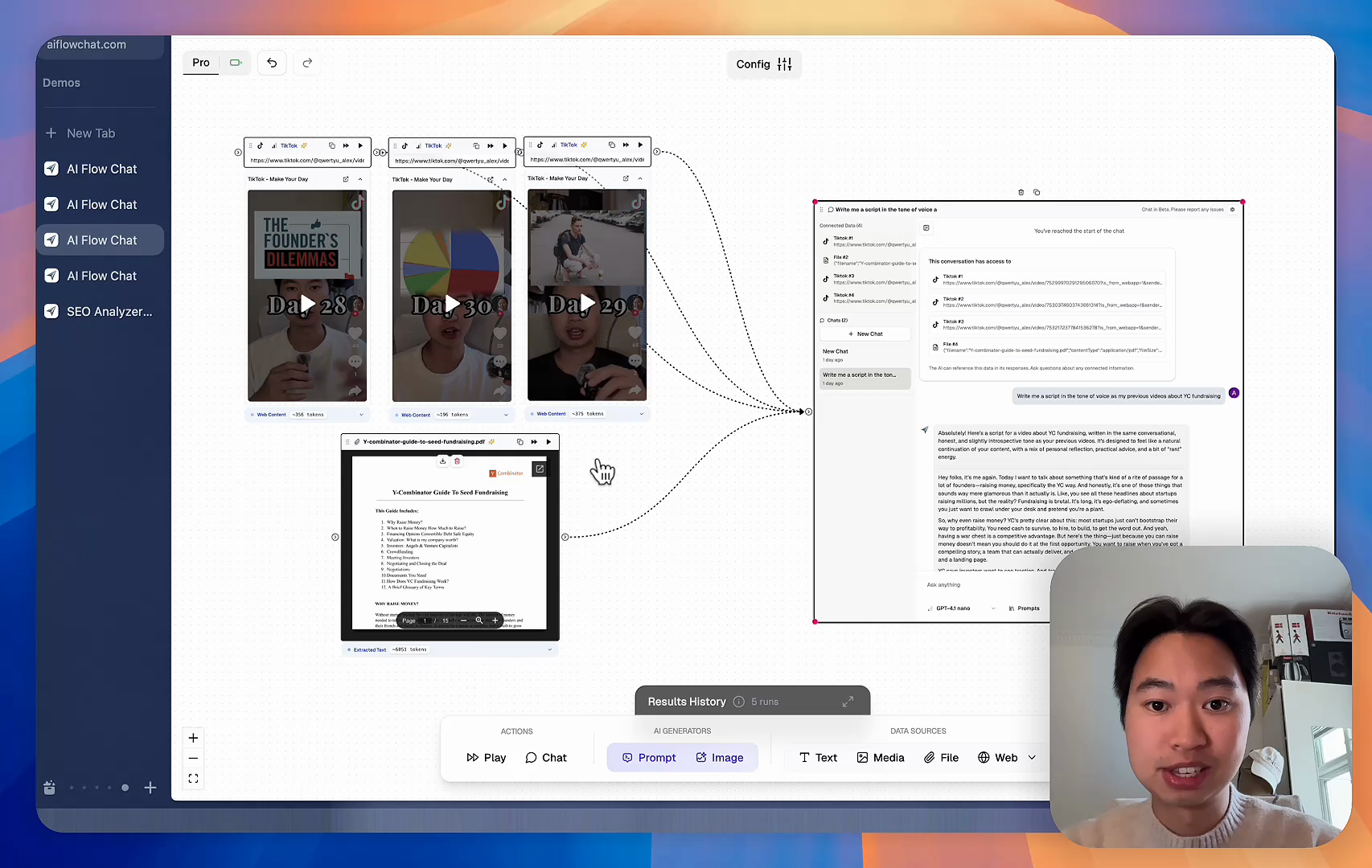
AI Flow Chat powers our entire content strategy. We double down on what’s working, extract viral elements, and create stuff fast.
Video thumbnail

Reference Anything

Bring anything into context of AI and build content in seconds

YouTube

PDF

DOCX

TikTok

Web

Reels

Video Files

Twitter Videos

Facebook/Meta Ads

Tweets

Coming Soon

Audio Files

Coming Soon

Choose a plan to match your needs

Upgrade or cancel subscriptions anytime. All prices are in USD.

Basic

For normal daily use. Ideal for getting into AI automation and ideation.

$30/month
  • See what Basic gets you
  • 11,000 credits per month
  • Access to all AI models
  • 5 app schedules
  • Free optional onboarding call
  • 1,000 extra credits for $6
Get Started

No risk, cancel anytime.

ProRecommended

For power users with high-volume needs.

$100/month
  • See what Pro gets you
  • 33,000 credits per month
  • Access to all AI models
  • 10 app schedules
  • Remove AI Flow Chat branding from embedded apps
  • Free optional onboarding call
  • 2,000 extra credits for $6
Get Started

No risk, cancel anytime.

Frequently Asked Questions

Everything you need to know about AI Flow Chat. Still have questions? Contact us.